Каталог
Категории товаров
- (Компьютерная техника
- DJ Groove Production
- IP / сетевые камеры
- LED-ТЕЛЕВИЗОР
- RFID
- TV-тюнеры для ПК
- USB Флешки
- Автомобили и инструменты
- Аксессуары для Mac
- Аксессуары для Xbox Series X & S
- Аксессуары для видеокарт
- Аксессуары для компьютерной техники
- USB-концентраторы
- Адаптеры
- Док-станции
- Док-станции для жестких дисков
- Док-станции для ноутбуков
- Кабели, разъемы, переходники
- Коврики для мыши
- Компьютерные док-станции
- Корпуса и док-стойки для ноутбуков
- Платформы для мышей
- Сетевые фильтры и удлинители
- Сумки и рюкзаки для ноутбуков
- Считыватели смарт-карт
- Аксессуары для компьютерной техники
- Аксессуары для мониторов
- Аксессуары для ноутбуков
- Аксессуары для ноутбуков
- Аксессуары для оргтехники
- Аксессуары для оргтехники
- Аудио микшеры
- Беспроводные адаптеры
- Бизнес-проекторы
- Бортовые системы видеонаблюдения
- Велосипеды
- Внешние дисковые накопители и оптические приводы
- Внешние приводы CD / DVD / Blu-Ray
- Внутренние твердотельные накопители
- Водяные системы охлаждения
- Гаджеты
- Генераторы
- Графические процессоры / Видеокарты
- Десктопные компьютеры
- Десктопы
- Док-станции, адаптеры и репликаторы портов
- Доковые станции
- Дом и природа
- ЖК / LED мониторы
- Загружаемые игры
- Здоровье и спорт
- Игровой настольный ПК
- Игровые клавиатуры
- Игровые контроллеры для ПК
- Игровые мониторы
- Игровые мониторы
- Игровые ноутбуки
- Игровые ноутбуки
- Игровые столы
- Игрушки, дроны и мейкеры
- Игры и VR
- Искусство и ремесла
- Кабели и разъемы для сетевого оборудования
- Камеры безопасности и видеонаблюдение
- Камеры для съемки
- Картриджи и расходные материалы
- Карты памяти
- КВМ-коммутаторы
- Клавиатура
- Клавиатуры
- Комплекты клавиатур и мышей
- Компоненты и хранение
- SSD
- USB-накопители и карты памяти
- USB-накопитель и карта памяти
- Адаптер и смена пола
- Аксессуары для ноутбуков
- Вентиляторы & Охлаждение ПК
- Готовые / миникомпьютеры
- Графические процессоры & Видеографические устройства
- Графический процессор и видеографическое устройство
- Жесткие диски
- Жесткий диск
- Защита питания
- Звуковая карта
- Звуковые карты
- источник питания
- Источники питания
- Кабели
- Кабель
- Компьютерные аксессуары
- Компьютерный корпус
- Материнская плата
- Материнские платы
- Память
- Переходники и смена пола
- Сетевое хранилище данных (NAS)
- Твердотельные накопители
- Устройства записи CD / DVD / Blu-Ray & Media
- Устройство для записи CD / DVD / Blu-Ray и носители информации
- Центральные процессоры / Процессоры
- Центральный процессор / Processor
- Компьютерная акустика
- Компьютерная периферия
- Гарнитура, динамик и звуковая карта
- Гарнитуры, динамики и звуковые карты
- Клавиатура и мышь
- Клавиатуры и мыши
- Монитор
- Мониторы
- Принтеры / Сканеры и расходные материалы
- Устройства ввода
- Устройство ввода
- KVM-переключатель
- Аксессуары для звуковых карт
- Аксессуары для ковриков для мыши и клавиатуры
- Веб-камера
- Втулка
- Гарнитуры и аксессуары
- Графические планшеты
- Дополнительные карты
- Звуковая карта
- Игровая клавиатура
- Игровая мышь
- Игровой контроллер для ПК
- Игровые гарнитуры
- Клавиатура
- Клавиатура|Компьютерная периферия
- Микрофон
- Мышь
- Компьютерная периферия
- Компьютерная техника
- 3D-принтеры
- USB Флешки
- USB-концентраторы
- Аксессуары для компьютерной техники
- Bluetooth адаптеры
- HDMI-переходники и кабели
- KVM-переключатели
- SSD
- USB Флешки
- USB-концентраторы
- Адаптеры
- Адаптеры и кабели
- Адаптеры и конвертеры
- Адаптеры и переходники
- Адаптеры питания
- Аккумуляторные батареи для ИБП
- Аксессуары для iPhone
- Аксессуары для iPhone и iPad
- Аксессуары для VR
- Аксессуары для VR-шлемов
- Аксессуары для гарнитур
- Аксессуары для гарнитур VR
- Аксессуары для графических планшето
- Аксессуары для графических планшетов
- Аксессуары для графических планшетос
- Аксессуары для джойстиков
- Аксессуары для камер видеонаблюдения
- Аксессуары для клавиатур
- Аксессуары для мобильных устройств
- Аксессуары для наушников
- Аксессуары для ноутбуков
- Аксессуары для оргтехники
- Аксессуары для планшетов
- Аксессуары для серверов
- Антенны
- Беспроводные зарядки
- Блоки питания для компьютеров
- Будильники
- Внешние жесткие диски и SSD
- Держатели для проводов
- Док-станции
- Док-станции для жестких дисков
- Док-станции для ноутбуков
- Запчасти для ноутбуков
- Зарядные устройства
- Защитные пленки и стекла для планшетов
- Защитные пленки и стекла для планшетос
- Защитные пленки и стекла для планшетот
- Защитные пленки и стекла для планшетоф
- Игровые кресла
- Источники бесперебойного питания
- Кабели и разъемы для компьютерной техники
- Кабели и разъемы для сетевого оборудования
- Кардридеры
- Картосчитыватели
- Картридеры
- Карты флэш-памяти
- Клавиатуры
- Коврики для мыши
- Комплекты клавиатур и мышей
- Компьютерные гарнитуры
- Компьютерные кабели, разъемы, переходники
- Корпуса и док-станции для жестких дисков
- Крепежные системы
- Криптовалютные кошельки
- Кронштейны, держатели и подставки для компьютерной техники
- Мобильные телефоны
- Оборудование для аудио- и видеоконференций
- Оптические приводы
- Панели для настенной установки
- Платы ввода-вывода
- Подарочные карты
- Подсветка для ПК
- Подставки и столы для ноутбуков
- Репликаторы портов
- Ридеры
- Рюкзаки для ноутбуков
- Сетевое оборудование
- Сетевые фильтры
- Сетевые фильтры и стабилизаторы
- Смарт-часы
- Стойки и подставки для компьютерной техники
- Сумки и рюкзаки для ноутбуков
- Считыватели карт памяти
- Тачпады
- Умные часы
- Усилители WiFi сигнала
- Чехлы для планшетов
- Читалки карт памяти
- Чтецы карт памяти
- Электронные доски
- Аксессуары для ноутбуков
- Аксессуары для оргтехники
- Аксессуары для планшетов
- Аксессуары для серверов
- Аксессуары для фотоаппаратов и объективов
- Аудиоредакторы
- Веб-камеры
- Видеозахват
- Внешние жесткие диски и SSD
- Внутренние жесткие диски (HDD)
- Внутренние твердотельные накопители (SSD)
- Графические планшеты
- Источники бесперебойного питания
- Комплектующие и аксессуары
- Компьютерные гарнитуры
- Компьютерные кабели, разъемы, переходники
- Компьютерные комплекты и корпуса
- Компьютерные корпуса
- Компьютеры
- Компьютеры и комплектующие
- Кулеры и системы охлаждения для компьютеров
- Мини-компьютеры
- Мини-ПК
- Мини-ПК и NUC
- Миниоколоды
- Минионоблоки
- Мобильные телефоны
- Мобильные телефоны и аксессуары
- Мобильные телефоны и смартфоны
- Мониторы
- Моноблоки
- Накопители данных
- Ноутбуки
- Ноутбуки и Компьютеры
- Gaming ПК и мини-ПК
- Gaming-Настольные компьютеры
- Mini PC и нетбоки
- Аксессуары для ноутбуков
- Внутренние жесткие диски (HDD)
- Игровые компьютеры и ноутбуки
- Клавиатуры
- Компактные компьютеры
- Компьютерные комплектующие
- Компьютерные корпуса
- Компьютеры
- Материнские платы
- Мини PC
- Мини ПК
- Мини-компьютеры
- Мини-ПК)
- Миникомпьютеры
- Миниофисы
- Моноблоки (мини-ПК)
- Моноблоки и минидесктопы
- Ноутбуки
- Ноутбуки для игр
- Пrewbuilt компьютеры
- ПК для игр
- Планшеты
- Планшеты и ноутбуки
- Промышленные компьютеры
- Процессоры (CPU)
- Прочие аксессуары для ноутбуков
- Прочие комплектующие для компьютеров
- Ноутбуки и мини-компьютеры
- Ноутбуки и мини-ПК
- Ноутбуки и планшеты
- Оборудование для аудио- и видеоконференций
- Онлайн игры
- Оргтехника
- Основная платформа
- Офисная мебель
- Периферийные устройства
- KVM Switch
- KVM Switches
- KVM-переключатели
- Nintendo Switch
- TV-тюнеры для ПК
- USB Флешки
- USB-концентраторы
- VR Headset
- VR-очки
- VR-шлемы
- Адаптеры
- Адаптеры и конвертеры
- Аксессуары для компьютерной техники
- Веб-камеры
- Видеозахват
- Графические планшеты
- Звуковые карты
- Игровые контроллеры
- Игровые кресла
- Кабели и разъемы для сетевого оборудования
- Картридеры
- Картриджи и расходные материалы
- Карты флэш-памяти
- Клавиатуры
- Коврики для мыши
- Комплекты клавиатур и мышей
- Компьютерная акустика
- Компьютерные гарнитуры
- Компьютерные кабели, разъемы, переходники
- Лазерные указки
- Микрофоны
- Миниатюрные клавиатуры и пульты
- Мобильные телефоны
- Мониторы
- Мултимедиа-проекторы
- Мыши
- Накопители FDD, MOD, ZIP, Jazz, стримеры
- Оптические приводы
- Переключатели
- Переходники и адаптеры
- Презентаторы
- Проекторы и аксессуары
- Прочее
- Прочие комплектующие для компьютеров
- Пульты дистанционного управления
- Рули, джойстики, геймпады
- Считыватели
- Считыватели карт
- Считыватели смарт-карт
- Штативы и моноподы
- Периферия и аксессуары
- Периферия компьютера
- Планшеты
- Программное обеспечение
- Промышленные компьютеры
- Процессоры (CPU)
- Прочее
- Прочее комплектующие для компьютеров
- Прочие комплектующие для компьютеров
- Серверы
- KVM-переключатели и удлинители
- Аксессуары для серверов
- Блоки питания для компьютеров
- Видеокарты
- Внутренние жесткие диски (HDD)
- Внутренние твердотельные накопители (SSD)
- Источники бесперебойного питания
- Компьютерные комплектующие
- Корпуса и док-станции для жестких дисков
- Кулеры и системы охлаждения для компьютеров
- Материнские платы
- Модули памяти
- Накопители данных
- Оперативная память
- Операционные системы
- Оптические приводы
- Память
- Память для серверов
- Программное обеспечение
- Промышленные компьютеры
- Процессоры (CPU)
- Прочее
- Прочее сетевое оборудование для компьютеров
- Прочие комплектующие для компьютеров
- Сетевое оборудование
- Сетевое оборудование
- Адаптеры
- Аксессуары для компьютерной техники
- Аксессуары для серверов
- Аксессуары для сетевого оборудования
- Внешние жесткие диски и SSD
- Кабели и разъемы для сетевого оборудования
- Коммутаторы
- Коммутационные панели и компоненты
- Компьютерные кабели, разъемы, переходники
- Конвертеры интерфейсов и скоростей
- Проводные роутеры (маршрутизаторы) и коммутаторы
- Проводовные роутеры (маршрутизаторы) и коммутаторы
- Прочее сетевое оборудование для компьютеров
- Прочие комплектующие для компьютеров
- Роутеры
- Сетевые карты и адаптеры
- Сетевые накопители
- Сплиттеры
- Точки доступа Wi-Fi
- Трансиверы
- Усилители Wi-Fi
- Компьютерная техника > Аксессуары для компьютерной техники > Радиаторы охлаждения и системы охлаждения
- Компьютерная техника > Игровые компьютеры
- Компьютерная техника > Игровые ПК > Полные игровые компьютеры
- Компьютерная техника > Компьютеры для игр и работы
- Компьютерная техника > Материнские платы > Профессиональные материнские платы
- Компьютерная техника > Мониторы и дисплеи > Гейминговые мониторы
- Компьютерная техника > Ноутбуки > Игровые ноутбуки
- Компьютерная техника > Ноутбуки > Профессиональные ноутбуки > HP Элитбук
- Компьютерные игры и аксессуары
- Компьютерные кабели, разъемы, переходники
- Компьютерные комплектующие
- KVM
- KVM Switch
- KVM-переключатели
- KVM-переключатели и аксессуары
- USB Флешки
- USB-концентраторы
- Адаптеры
- Аксессуары для графических планшетов
- Аксессуары для компьютерной техники
- Блоки питания для компьютеров
- Вентиляторы для компьютеров
- Вентиляторы и системы охлаждения для компьютеров
- Видеозахват
- Видеокарты
- Внешние жесткие диски и SSD
- Внутренние жесткие диски (HDD)
- Внутренние и внешние устройства
- Внутренние модули памяти
- Внутренние накопители данных
- Внутренние твердотельные накопители (SSD)
- Графические планшеты
- Звуковые карты
- Источники бесперебойного питания
- Кабели и разъемы для компьютерной техники
- Кабели и разъемы для сетевого оборудования
- Карти и кассеты
- Карти и расходные материалы
- Картиджри и расходные материалы
- Картидриджи и расходные материалы
- Картички и картридеры
- Картички и расходные материалы
- Картридеры
- Картриджи и расходные материалы
- Карты флэш-памяти
- Клавиатуры
- Коврики для мыши
- Коммутаторы
- Компьютерные блоки питания
- Компьютерные кабели, разъемы, переходники
- Компьютерные карты
- Компьютерные карты и адаптеры
- Компьютерные карты, разъемы, переходники
- Компьютерные корпуса
- Компьютерные корпуса и системы охлаждения для компьютеров
- Компьютерные памяти
- Компьютерные памяти и накопители
- Компьютерные периферийные устройства
- Компьютерные системы охлаждения
- Контроллеры
- Корпуса и док-станции для жестких дисков
- Кронштейны, держатели и подставки для компьютерной техники
- Кулеры и системы охлаждения для компьютеров
- Материнские платы
- Модules памяти
- Модули памяти
- Мыши
- Оптические приводы
- Память (RAM)
- Память для компьютеров
- Переключатели
- Переключатели HDMI
- Переключатели KVM
- Переключатели и матрицы HDMI
- Переключатели и разветвители
- Переходники и адаптеры
- Переходники и кабели
- Переходники и коммутаторы
- Переходники, кабели и разъемы
- Полномощные компьютеры и игровые станции
- Проводные роутеры (маршрутизаторы) и коммутаторы
- Промышленные компьютеры
- Промышленные компьютеры и ПК
- Процессоры и материнские платы
- Прочее
- Прочее комплектующие для компьютеров
- Прочие комплектующие для компьютеров
- Прочие компьютерные комплектующие
- Разветвители HDMI
- Свитчи
- Сетевые карты и адаптеры
- Термопасты
- Фитинги для водяного охлаждения
- Энкодеры
- Компьютерные комплектующие
- Компьютерные системы
- Компьютеры
- Компьютеры > Десктопные компьютеры > Игровые десктопы
- Корпуса для компьютеров
- Крепеж
- Кровати
- Массаж и релаксация
- Массажеры
- Материнские платы Intel
- Микрофон
- Мини-ПК Barebone
- Мобильная игровая консоль
- Моноблоки
- Мыши
- Мышь
- Накопители данных
- Накопители данных
- Настенные бра
- Настольный NAS
- Настольный центральный процессор Processor
- Наушники и аксессуары
- Носимые технологии
- Ноутбуки
- Оборудование для аудио- и видеоконференций
- Общие аксессуары для игровых консолей
- Объективы для фотоаппаратов
- Оргтехника
- Офисное оборудование
- Офисные решения
- Память
- Память ноутбука
- Память рабочего стола
- Память сервера
- Первая помощь, медицина и спасение
- Переключатели
- Периферийные устройства
- USB-концентраторы
- Аудио и видеоустройства
- Аудио- и видеоконференц-связь
- Веб-камеры
- Внешние жесткие диски и SSD
- Внешние накопители данных
- Внешние накопители и диски
- Внешние накопители и дисковые устройства
- Внешние накопители и периферия
- Графические планшеты
- Док-станции и адаптеры
- Докинг станции и адаптеры для компьютеров
- Звуковые карты
- Карты флэш-памяти
- Клавиатуры
- Клавиатуры и мыши
- Коврики для мыши
- Комплекты клавиатур и мышей
- Компьютерные адаптеры и кабели
- Компьютерные аксессуары
- Компьютерные гарнитуры
- Компьютерные док-станции и адаптеры
- Компьютерные кабели, разъемы, переходники
- Микрофоны
- Микрофоны и аудиоинтерфейсы
- Мобильные телефоны и смартфоны
- Монаторы
- Мониторы
- Мониторы и аксессуары для мониторов
- Мониторы и аксессуары к ним
- Мониторы и видеоадаптеры
- Мониторы и видеовыводы
- Мониторы и внешние устройства
- Мониторы и дисплеи
- Мониторы и дисплеи не включая моноблоки
- Мониторы и дисплейные адаптеры
- Мониторы и другие дисплейные устройства
- Мониторы и колонки
- Мониторы и принтеры
- Мониторы компьютеров
- Мониторы, Мыши, Клавиатуры, Компьютерная акустика
- Мыши
- Мыши и клавиатуры
- Мыши и компьютерная акустика
- Мыши и компьютерные гарнитуры
- Мыши, клавиатуры
- Мыши, клавиатуры, компьютерная акустика
- Рули, джойстики, геймпады
- Рюкзаки и сумки для ноутбуков
- Периферийные устройства > Мониторы компьютера > Игровые мониторы
- Портативный монитор
- Приборы
- Принтеры / сканеры и расходные материалы
- Принтеры и МФУ
- Проводные сети
- Программное обеспечение
- Программное обеспечение
- Программное обеспечение и услуги
- Проектор
- Проекторы для домашнего кинотеатра
- Производитель
- Процессоры — Настольные компьютеры
- Процессоры (CPU)
- Прочее
- Работа в сети
- Рабочие лампы
- Распродажа
- Резервный носитель
- Светодиодные лампы
- Сервер и компоненты
- Серверы
- Сетевое оборудование
- Сетевое оборудование
- Системы Nintendo Switch
- Сканеры
- Сканеры документов
- Сотовые телефоны — разблокированные
- Считыватели карт
- Телевизоры и домашние кинотеатры
- Телефонные и конференц-устройства
- Телефоны / VoIP
- Трекеры активности
- Умные дверные замки и доступ
- Умный дом и безопасность
- Устройства для захвата видео
- Устройство и носитель резервного копирования
- Уход за полостью рта
- Фены для волос
- Флоппи-дисковод Дискета
- Часы
- Чернильные картриджи (оригинальные марки)
- Швейные машины
- Электроника
- Pro Audio & Музыкальные инструменты
- Аккумуляторы, пауэрбанки и зарядные устройства
- Аксессуары для сотовых телефонов
- Аксессуары для цифровых камер
- Альтернативная энергия
- Гаджеты и носимые устройства
- Домашнее аудио и домашний кинотеатр
- Наушники
- Оригинальные аксессуары для планшетов
- Планшеты
- Портативные колонки
- Портативные электронные устройства
- Проектор
- Профессиональные видеоустройства
- Сотовые телефоны
- Телевидение и видео
- Цифровые фотоаппараты
- Чехлы и обложки
- Товары в России
- Уцененый товар
Моя корзина
Poly — Voyager 4320 UC Wireless Headset + Charge Stand (Plantronics) — Headphones w/Mic — Connect to PC/Mac via USB-A Bluetooth Adapter, Cell Phone via Bluetooth-Works w/Teams (Certified), Zoom&More
0
Код товара: N82E16826265404
Предложение актуально на:01/12/2024
 — Headphones w/Mic — Connect to PC/Mac via USB-A Bluetooth Adapter, Cell Phone via Bluetooth-Works w/Teams (Certified), Zoom&More")
23,842.32 руб.
Wireless Type: Bluetooth
Cord Length: Charging cable length: 1.5 meters/ 4.9 feet
Part Number: 218476-02
Headphone Frequency Response: 20Hz-20KHz
Color: Black
Noise Cancelling: Yes
Cord Length: Charging cable length: 1.5 meters/ 4.9 feet
Part Number: 218476-02
Headphone Frequency Response: 20Hz-20KHz
Color: Black
Noise Cancelling: Yes
Доставка из ориентировочно 10.02.2026.
Пошлина: 3,576.35 руб.
В наличии
180 в наличии (может быть предзаказано)
В избранноеВ избранном0
В сравнениеДобавлено в сравнение0
21 человек смотрят это товар.
This is a HTML code snippet with embedded CSS styles, written in a proprietary format (likely used by Newegg.com). I’ll provide an analysis of the code and highlight some key points.
**Summary**
The code defines a set of CSS rules for styling elements on a webpage. The rules are specific to a particular product page (`sku-1VH-0006-00AB5`) within the `overview-content` container. The styles cover various aspects, including layout, typography, and table formatting.
**Key Points**
1. **Responsive design**: The CSS media query at the bottom of the code snippet targets devices with a maximum width of 767px (i.e., mobile devices). This suggests that the website has a responsive design to adapt to different screen sizes.
2. **Table styling**: The CSS rules for tables are specifically designed to transform them into a more readable format on smaller screens. This is achieved by displaying table headers as absolute positions and wrapping each table cell (`td.column`) in its own block element, creating a «fake» table header with descriptive text.
3. **Customizable padding**: The code defines various CSS classes for elements that can have custom padding values (e.g., `.a_plus_module`, `.a_plus_info`). This allows the website’s designers to control the spacing and layout of different sections on the page.
4. **Device-specific styling**: The media query targets mobile devices specifically, suggesting that the website’s design is tailored to provide an optimal user experience on smaller screens.
**Recommendations**
Based on this analysis, here are some recommendations for improving the code:
1. **Consolidate CSS rules**: Some CSS classes (e.g., `.col-1`, `.col-2`) seem to be redundant or unnecessary. Consider consolidating these into a single class with different values.
2. **Use more descriptive variable names**: The variable names like `sku-1VH-0006-00AB5` are quite long and not very descriptive. Try to use shorter, more meaningful names that convey the purpose of each rule.
3. **Follow best practices for table styling**: While the current implementation works on mobile devices, it might be more suitable to follow conventional table styling guidelines (e.g., using `display: flex;` or `grid`) to create a consistent user experience across all screen sizes.
Overall, this code snippet provides valuable insights into how a website can adapt its design to accommodate various device types and screen sizes.
Детали
|
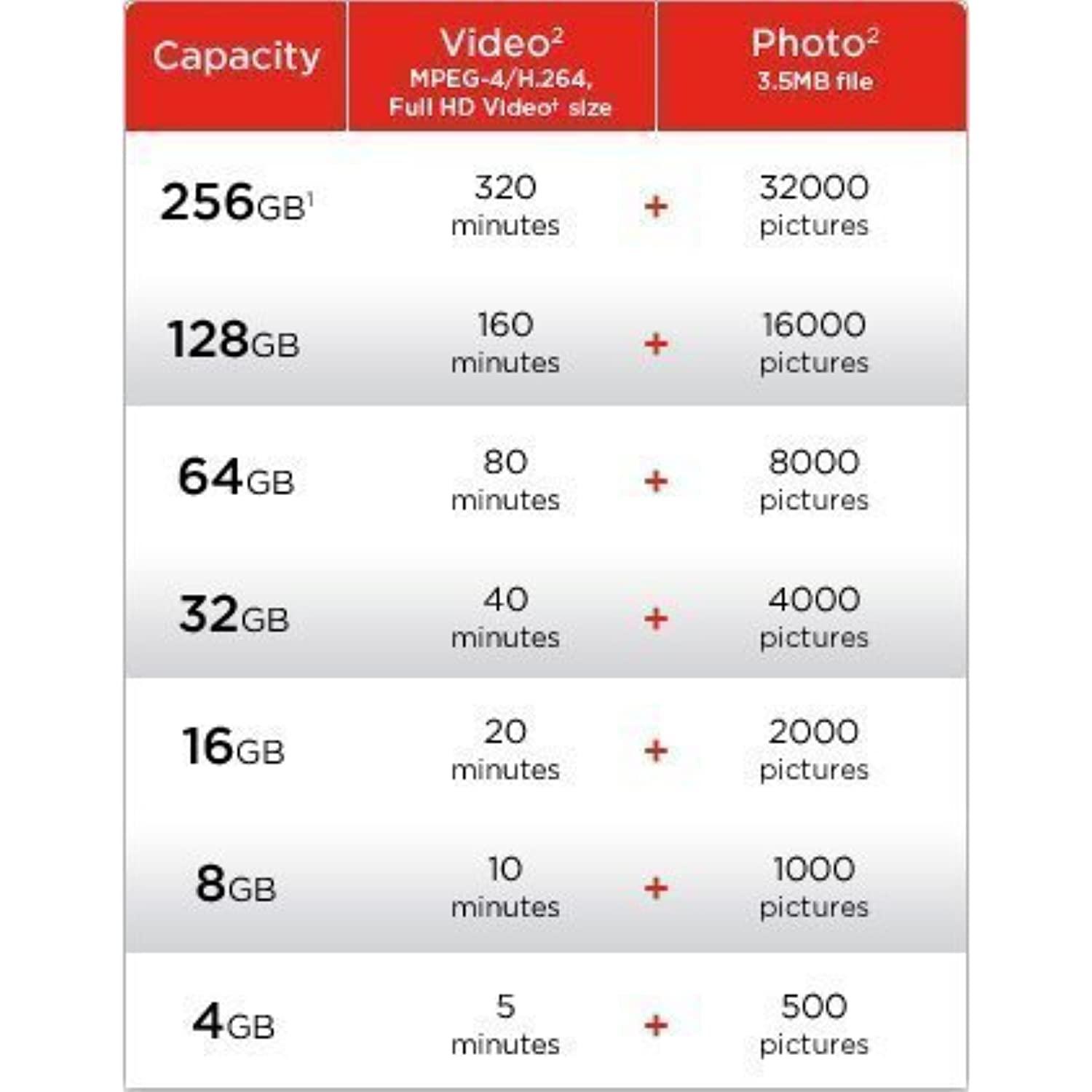
||||||||||||||||||||||||||||||||||||||||
| Dimensions | ||||||||||||||||||||||||||||||||||||||||
|---|---|---|---|---|---|---|---|---|---|---|---|---|---|---|---|---|---|---|---|---|---|---|---|---|---|---|---|---|---|---|---|---|---|---|---|---|---|---|---|---|
|
||||||||||||||||||||||||||||||||||||||||
User Reviews
0.0 out of 5
★★★★★
0
★★★★★
0
★★★★★
0
★★★★★
0
★★★★★
0
Only logged in customers who have purchased this product may leave a review.
С этим товаром покупают
-
") 5 в наличии (может быть предзаказано)Оценка 0 из 56,691.90 руб.
5 в наличии (может быть предзаказано)Оценка 0 из 56,691.90 руб. -
 20 в наличии (может быть предзаказано)Оценка 0 из 5141,749.13 руб.
 -
10 в наличии (может быть предзаказано)Оценка 0 из 5143,509.23 руб.
-
 Доступно для предзаказаОценка 0 из 58,367.52 руб.


There are no reviews yet.